Open source / v0.4.0
Your ideas.
Your ideas.
Rendered.
Turn code into diagrams, charts, and animations. One editable TSX scene. Dark and light. Ready for your docs, your team, and your agents.
npm install -g vizmaticMade with Vizmaticscene.tsx → visual
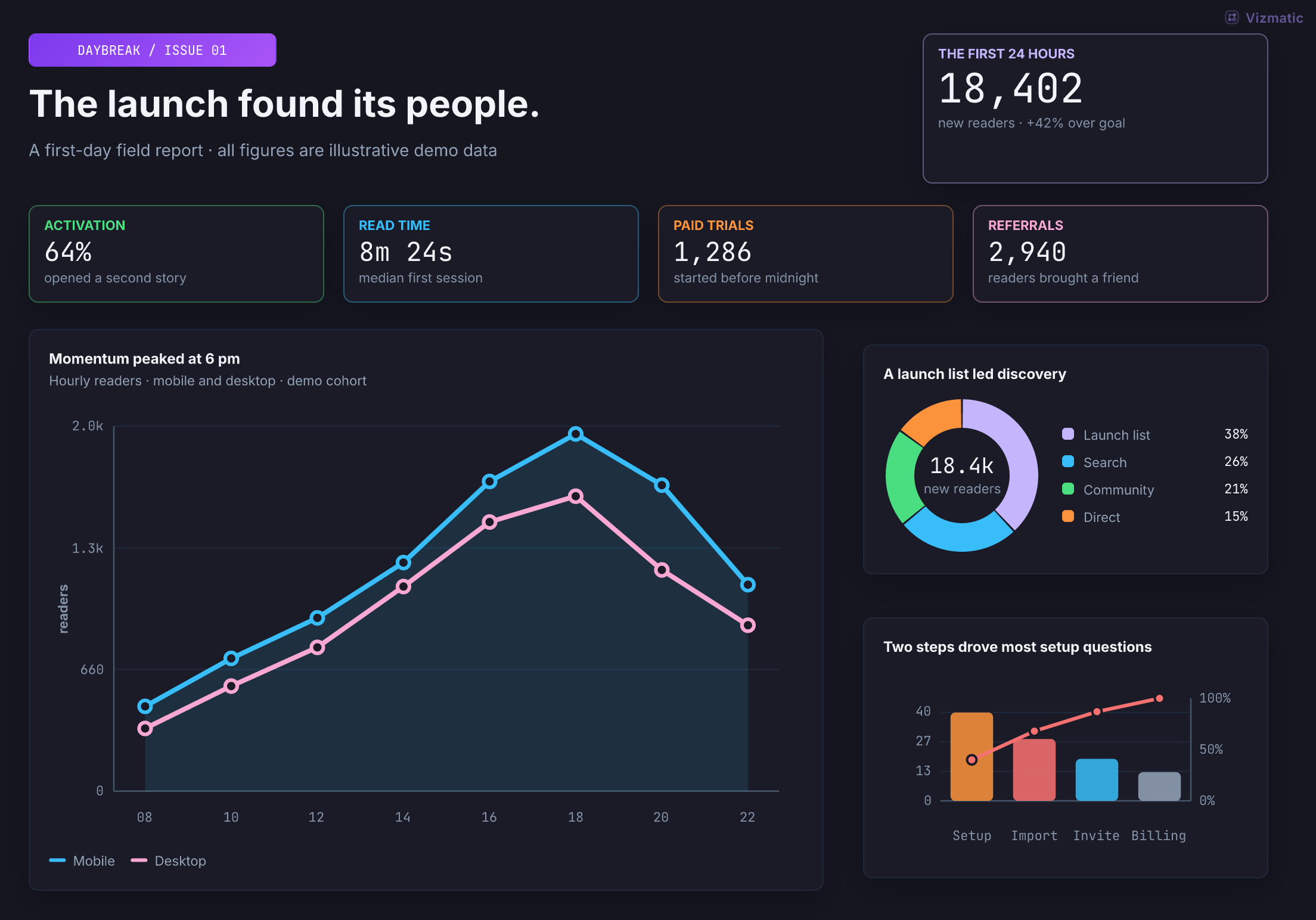
Real output. Editable source.
Daybreak launch
Dark + light, from the same scenePNG · SVG · GIF
Editable TSX
Theme-aware
Layout diagnostics
Headless export
Made to move
A little code.
A lot of motion.
Watch a cloud of observations become a story. Staggered entrances, a line that draws itself, and a camera that knows where to look. Every frame comes from one editable TSX scene.
From noise to signal18 seconds · 720p · 30 fps · Silent
A least-squares fit through synthetic data, brought to life with typed timelines and parallel tracks. Press play, jump to a chapter, or make it yours.
Render your own
npm install --save-dev \
  vizmatic@0.4.0 react
npx vizmatic video \
  ./request-lifecycle.tsx \
  --out ./videos \
  --theme dark --fps 30
Use Node.js 20+ and FFmpeg with the libx264 encoder. Add --audio narration.wav for a voice track; FFmpeg must also include AAC. Keep VTT or SRT captions as sidecar files. New npm and pnpm projects should apply the consumer dependency pins. Read the video guide ↗
Read the visual story
The film opens with “Make the invisible click.” Twelve synthetic observations arrive in a chart. A least-squares trend line traces from left to right while a marker follows it. The camera moves closer, and a callout explains the fitted slope. The original observations remain visible. The closing frame reads “Give your ideas a little motion.”
Try the building blocks
Choose a component.
Make it your own.
Explore 75 components. Edit chart data, route connectors, or start a canvas and arrange your own visual.
Open the visual builder →Start with a story
Every piece is yours to editComponent playground
Choose. Change. See.
Explore a live example, then make it your own.
Your edits are saved in this browser.
Canvas and palette Size, style, and every theme color
Colors and canvas settings stay with your source.
Live previewLoading components…960 × 540
Double-click text to edit. Enter saves. Escape cancels.
Play with the settings
Updates as you change themEdit the TSX Change data, add components, or compose a scene
Choose your starting point
A canvas for you.
A toolkit for your agent.
Explore in the browser or bring visuals into your coding workflow. The source stays yours to edit.
The possibilities
Start with a real example.
A launch brief, an incident room, a model decision, or a weekend city guide. Open a scene and make every piece your own.
Aurora incident room reliability
Try / editModel garden decision map
Try / editWeekend field notes city guide
Try / editAnimated pipeline GIF
Try / editConnector routing routing
Try / editPie chart pie
Try / editPareto bar chart 80/20
Try / editRAG control graph graph
Try / editEvaluation dashboard data
Try / editSystem architecture graph
Try / editPareto frontier cost × score
Try / editAttention head research
Try / editAgent to visual asset Vizmatic
Try / editDecision quadrants highlight target
Try / editBuilding blocks charts + hierarchy
Try / editNCCL Broadcast one → all
Try / editNCCL AllReduce all → all
Try / editNCCL AllGather concat on all
Try / editNCCL ReduceScatter one chunk / rank
Try / editNCCL AllToAll all ↔ all
Try / editPresentation frame deck
Try / editApproach map scatter plot
Try / editSequence diagram request lifecycle
Try / editTyped dataflow lineage + schemas
Try / editDeployment view network + trust
Try / editTransformer topology tensor + collective
Try / editEngineering preset article
Try / editRender pipeline flow
Try / editModel router routing
Try / editEmbedding map scatter
Try / editToken matrix heatmap
Try / editTheme system tokens
Try / editSpec anatomy documentation
Try / editRelease card example
Try / editTransparent badge embed
Try / editTheme background opaque
Try / editRender workflow workflow
Try / editNo examples in this category.
All visuals rendered with Vizmatic.
From source to something worth sharing
Small scene.
Big possibilities.
Start with a plain frame.tsx. Compose the pieces, check the layout, and export both themes.
No imports needed for a bare frame. Add data, helpers, or a title when the visual needs them.
PNGSVGGIF
Explore 75 components frame.tsxTSX
<Scene title="From idea to visual">
  <Flow stages={[
    { title: "Compose", tone: "blue" },
    { title: "Check", tone: "purple" },
    { title: "Render", tone: "green" },
  ]} />
</Scene>TerminalNode.js 20+
vizmatic check ./frame.tsx --theme dark,light --json
vizmatic ./frame.tsx --out ./visuals --theme dark,light
PNG and SVG are transparent by default. Use --background theme for an opaque canvas.
Built for your workflow
Good visuals.
Repeatable process.
Compose with meaning.
Use semantic color tones and components that fit your story. Keep editable source next to your code.
Check before you share.
Run diagnostics for layout, contrast, and assets. Inspect the rendered output in both themes.
Render anywhere.
Export static assets in Node or CI. Use typed state timelines when your explanation needs motion.
The next idea starts here
Your agent can
make this, too.
Give it the components, the workflow, and a clear brief. Start with one prompt, or install the skill for future tasks.
Portable agent skill
One install. Your favorite agent.
Instructions for Codex, Claude Code, Cursor, OpenCode, and other agents that support skills.
npx skills add bvolpato/vizmatic --skill vizmatic -g -yCodexClaude CodeCursorOpenCode
Machine-readable resources →Read the full agent prompt
# Vizmatic agent prompt

Use Vizmatic to create diagrams, figures, dashboards, presentation frames, animated GIFs, and MP4 videos from React scene primitives. Render dark and light files locally or in CI.

## Quick start

Vizmatic requires Node.js 20 or newer. Install the CLI:

```bash
npm install -g vizmatic
```

Create `frame.tsx`:

```tsx
<Scene title="Agent visual pipeline">
  <Flow
    connectorTone="purple"
    stages={[
      { title: "Prompt", tone: "blue" },
      { title: "Scene spec", tone: "purple" },
      { title: "PNG / SVG / GIF", tone: "green" },
    ]}
  />
</Scene>
```

Render dark and light assets:

```bash
vizmatic ./frame.tsx --out ./dist/frames --theme dark,light
```

Check the scene before publishing:

```bash
vizmatic check ./frame.tsx --theme dark,light --json
```

Fix all errors before the final render. Warnings report low contrast, text below 11px, overlapping labels, uneven panel whitespace, connector congestion, and asset fallbacks. Overflow errors name the affected edges and suggest dimensions.

The [browser playground](https://bvolpato.github.io/vizmatic/playground.html) supports component composition, inline text edits, undo/redo, and local drafts. Choose Freeform canvas for positioned `Board` / `CanvasItem` editing with move and resize handles and snapping. Structured editors cover pie segments, bar categories, scatter points, table cells, line series, interval data, and graph nodes/edges/groups; computed data stays in TSX. Save project writes a named `.vizmatic.json` file containing source, output theme, and canvas background, and Open project restores it. PNG/SVG exports preserve the full canvas.

For scenes already created inside a build or editor, use the typed `checkFrame` API instead of writing a frame file and launching the CLI. Pass a React element as `scene` or use `create(theme)` for theme-specific scenes. Set `failOn` to `"warning"` when warnings should fail CI. Reports include per-theme dimensions and diagnostics with stable codes plus element IDs or rendered locations where available. Use `vizmatic check <files> --json` when the CLI should discover and load frame modules.

## Install in a project

Use the package manager already present in the project.

Add Vizmatic to a project for scripts, editor types, or direct renderer APIs:

```bash
pnpm add vizmatic react
```

To use the current GitHub version:

```bash
pnpm add github:bvolpato/vizmatic react
```

Use the equivalent command for npm, Yarn, or Bun projects.

## Full frame example

Create `frames/agent-pipeline.tsx`:

```tsx
width = 1040;
height = 560;

<Scene
  title="Agent visual pipeline"
  subtitle="prompt -> TSX scene -> render -> files"
  gap={26}
>
  <Flow
    connectorTone="purple"
    stages={[
      {
        eyebrow: "input",
        title: "Prompt",
        subtitle: "intent and constraints",
        tone: "blue",
        lines: ["domain language", "audience", "theme tokens"],
        width: 190,
      },
      {
        eyebrow: "contract",
        title: "Scene spec",
        subtitle: "typed structure",
        tone: "purple",
        lines: ["cards", "flows", "charts", "tables"],
        width: 190,
      },
      {
        eyebrow: "render",
        title: "Node renderer",
        subtitle: "headless output",
        tone: "cyan",
        lines: ["layout", "theme", "checks"],
        width: 190,
      },
      {
        eyebrow: "output",
        title: "PNG / SVG / GIF",
        subtitle: "rendered files",
        tone: "green",
        lines: ["dark + light", "alpha", "manifest"],
        width: 190,
      },
    ]}
  />
  <Row width="100%" gap={14}>
    <CalloutCard
      title="Use scene primitives"
      detail="Common diagrams do not need hand-written SVG paths or x/y coordinates."
      tone="purple"
      width={470}
    />
    <CalloutCard
      title="Use theme tokens"
      detail="Tokens set color, typography, radius, spacing, and contrast."
      tone="green"
      width={470}
    />
  </Row>
</Scene>
```

Render it:

```bash
vizmatic frames --out public/vizmatic --theme dark,light --watermark "Your Product" --watermark-image ./logo.svg --watermark-position top-right
```

Generated `manifest.json` includes each output file plus its theme, path, width, and height.

The static CLI defaults to PNG. Add `--format svg` for vector output or `--format both` to render PNG and SVG together in every requested theme.

PNG and SVG renders have transparent backgrounds by default. Use the theme background when the image needs an opaque canvas:

```bash
vizmatic frames --out public/vizmatic --theme dark,light --background theme
```

Or set it in the frame:

```tsx
<Scene background={c.bg} title="Opaque article figure">
  <Flow stages={[{ title: "Theme fill", tone: "purple" }]} />
</Scene>
```

CSS alpha colors are preserved in PNG/SVG backgrounds. Use `<Scene background="rgba(15, 23, 42, 0.5)">` or `--background 'rgba(15, 23, 42, 0.5)'` for a semi-transparent canvas. Leave the background unset for fully transparent output. Contrast checks composite alpha text and nested backgrounds over known solid surfaces; a transparent canvas has no known host-page backdrop.

When a CLI frame omits `width` or `height`, Vizmatic starts at `960x540` and grows that axis if content overflows. Set `autoSize = false` when dimensions must remain fixed and clipping should fail the render.

Bare CLI frames do not need imports, `defineIllustration`, or `c` props. Use `c` for explicit tokens such as `background={c.bg}`. `Scene` title and subtitle are optional. Use a full module for other dependencies, reusable helpers, animation exports, or direct renderer APIs.

Frame modules can export a watermark element instead of using CLI flags:

```tsx
import { Watermark } from "vizmatic"

export const watermark = (
  <Watermark position="bottom-right" opacity={0.82}>
    <div style={{
      display: "flex",
      alignItems: "center",
      gap: 6,
      color: "#7c3aed",
      fontFamily: "Inter",
      fontWeight: 800,
      fontSize: 12,
    }}>
      <img src="data:image/svg+xml;base64,..." width={14} height={14} />
      Your Product
    </div>
  </Watermark>
)
```

Render a sampled state timeline with `createAnimation(theme)`:

```bash
vizmatic gif frames/animated-pipeline.tsx --out public/vizmatic --theme dark,light --fps 20 --watermark "Your Product" --watermark-image ./logo.svg --watermark-position top-right --scale 1
```

## Animated frames

An animated module exports `createAnimation(theme)` for GIF or MP4 output and keeps `create(theme)` for a static or reduced-motion fallback. Define state once, then describe holds, eased transitions, instant keyframes, and parallel property tracks. Vizmatic samples absolute timeline time and renders every frame.

For MP4, export `createAnimation(theme)` and run `vizmatic video frames/lesson.tsx --out public/videos --theme dark --fps 30`. This requires Node.js 20 or newer and FFmpeg with the `libx264` encoder; add `--audio narration.wav` for AAC audio. The CLI pads or trims audio to the animation duration. Exported canvas dimensions after `--scale` must be positive even integers. MP4 uses an opaque theme background by default and supports 1–120 fps independently of GIF cadence. The browser builder exports GIF; MP4 runs in Node.js. Keep `.vtt` or `.srt` captions as separate files and synchronize them to the finished timeline. Use `examples/videos/request-lifecycle.tsx` as a short, generic starting point and `examples/videos/signal-to-story.tsx` for a longer film with parallel tracks, path tracing, camera motion, and an ending held on screen. Animate the data or mechanism the lesson explains; avoid decorative logo or icon reveals. For package consumers, install Vizmatic and React in the project and FFmpeg separately. In the repository, `pnpm render:video` regenerates the showcase media.

```tsx
import React from "react"
import { Scene, defineAnimation, getThemeColors, hold, keyframe, tween, type ThemeMode } from "vizmatic"

export const width = 1040
export const height = 560

type State = { operation: number; progress: number }

function buildFrame(theme: ThemeMode, state: State) {
  const c = getThemeColors(theme)
  return (
    <Scene c={c} title={state.operation === 0 ? "Broadcast" : "AllReduce"}>
      <div style={{ display: "flex", width: "100%", height: 260, position: "relative" }}>
        <div style={{
          display: "flex",
          position: "absolute",
          left: 40 + state.progress * 720,
          top: 90,
          padding: "10px 16px",
          borderRadius: 8,
          background: c.accent,
          color: c.textOnColor,
        }}>chunk</div>
      </div>
    </Scene>
  )
}

export function createAnimation(theme: ThemeMode) {
  return defineAnimation<State>({
    initial: { operation: 0, progress: 0 },
    timeline: [
      hold(500, "Broadcast input"),
      tween({ progress: 1 }, { duration: 900, easing: "ease-in-out", label: "Broadcast" }),
      hold(500, "Broadcast output"),
      keyframe({ operation: 1, progress: 0 }),
      tween({ progress: 1 }, { duration: 900, easing: "ease-in-out", label: "AllReduce" }),
    ],
    fps: 20,
    render: (state) => buildFrame(theme, state),
  })
}

export function create(theme: ThemeMode = "dark") {
  return buildFrame(theme, { operation: 1, progress: 1 })
}

export default create("dark")
```

Top-level timeline steps run sequentially. Properties inside one `tween` move together. Use `parallel({ x: [...], opacity: [...] })` when property tracks need different delays or durations. Default interpolation supports finite numbers; use a custom `interpolate(from, to, progress)` for colors, points, or other values. Infinite loops should finish on the same visual state where they start. Fade moving content out and reset it with a zero-duration `keyframe` while hidden instead of reversing a one-way operation. `createScenes(theme)` remains supported for deliberate scene cuts and pixel `fade`/`appear` transitions.

## Choose primitives

Use Vizmatic primitives for common layouts. Use raw SVG only for geometry the component set cannot express.

Shared values:

- `ThemeMode`: `"dark" | "light"`.
- `ToneName`: `"blue" | "purple" | "green" | "warm" | "cyan" | "pink" | "red" | "critical" | "neutral" | "sunset" | "ocean" | "dark"`.
- `ColorName`: `"primary" | "secondary" | "positive" | "warning" | "critical" | "info" | "accent" | "neutral"`.
- `FlexAlign`: `"start" | "center" | "end" | "stretch"`.
- `FlexJustify`: `"start" | "center" | "end" | "space-between" | "space-around"`.
- Bare CLI frames omit `c` props. The local `c` object remains available for explicit values such as `background={c.bg}`.
- Full modules pass the `c: ThemeColors` value from `defineIllustration((c) => ...)` to visual components.
- PNG/SVG renders are alpha-transparent by default. Use `--background theme`, `background: "theme"`, or `<Scene background={c.bg}>` for opaque theme fill.
- Omitted CLI dimensions auto-grow on overflow. Explicit `width` / `height` remain fixed and fail on clipping.

## Component API

Frame helpers:

- `defineIllustration(build, defaultTheme?)`: `build: (c: ThemeColors) => ReactElement`, `defaultTheme?: ThemeMode = "dark"`. Returns `{ create(theme), default }`.
- `Canvas`: `children?`, `c`, `padding?: number = 40`, `justify?: "center" | "flex-start" | "space-between" | "space-around" = "center"`, `background?: string`. Default root background is alpha-transparent during PNG/SVG rendering.
- `Board`: `children?`, `c`, `width?: number = 960`, `height?: number = 540`, `background?: string`. Fixed relative canvas with a transparent default background; clips content outside its bounds. Match frame dimensions to the board. Dimensions must be finite, greater than zero, and at most 8192.
- `CanvasItem`: `children?`, `x: number`, `y: number`, `width?: number`, `height?: number`. Absolute position in logical board pixels. Coordinates must be finite. Explicit dimensions must be greater than zero and at most 8192; they supply the child's width/height props. With both dimensions set, chart primitives scale proportionally to fit their complete plotting layer, headings, legends, and footer inside the item. Use literal coordinates and dimensions for preview move/resize controls.
- `Scene`: `c`, `children`, `title?`, `subtitle?`, `padding?: number = 40`, `gap?: number = 24`, `justify?: "center" | "flex-start" | "space-between" | "space-around" = "flex-start"`, `align?: FlexAlign = "stretch"`, `contentWidth?: number | string = "100%"`, `background?`, `contentStyle?: React.CSSProperties`. Title/subtitle are optional and the title bar is omitted when no title is provided. Use `background={c.bg}` for an opaque theme frame.
- `TitleBar`: `title`, `subtitle?`, `c`.

Layout primitives:

- `Row` / `Column`: `children`, `gap?: number = 12`, `align?: FlexAlign = "center"`, `justify?: FlexJustify = "center"`, `wrap?: boolean = false`, `width?: number | string`, `height?: number | string`, `style?: React.CSSProperties`.
- `Stack`: `children`, `direction?: "vertical" | "horizontal" = "vertical"`, `gap?: number = 12`, `align?: "start" | "center" | "end" | "stretch" = "center"`, `wrap?: boolean = false`.
- `Panel`: `title`, `c`, `children?`, `subtitle?`, `tone?: ToneName = "blue"`, `footer?`, `width?`, `minWidth?`, `height?`, `minHeight?`, `padding?: number | string = 14`, `radius?: number = 8`, `gap?: number = 10`, `align?: FlexAlign = "stretch"`, `justify?: FlexJustify = "start"`, `shadow?: boolean = true`, `background?`, `borderColor?`, `titleFontSize?`, `accentWidth?: number = 34`, `accentHeight?: number = 4`, `bodyStyle?: React.CSSProperties`.
- `Card`: `children?`, `c`, `title?`, `subtitle?`, `tone?`, `footer?`, `width?`, `minWidth?`, `height?`, `minHeight?`, `padding?: number | string = 20`, `radius?: number = 8`, `gap?`, `align?: FlexAlign = "stretch"`, `justify?: FlexJustify = "start"`, `shadow?: boolean = false`, `background?`, `borderColor?`, `bodyStyle?: React.CSSProperties`.
- `WindowFrame`: `c`, `children?`, `title?`, `variant?: "window" | "browser" | "terminal" = "window"`, `tone?: ToneName = "blue"`, `dots?: boolean = true`, `width?`, `minWidth?`, `height?`, `minHeight?`, `padding?: number | string = 16`, `radius?: number = 10`, `shadow?: boolean = true`, `background?`, `bodyStyle?: React.CSSProperties`.

Cards, labels, and compact UI:

- `TextLabel`: `text`, `c`, `variant?: keyof typography = "body"`, `color?`, `fontSize?`, `fontWeight?`, `width?`, `align?: "left" | "center" | "right" = "left"`, `math?: boolean = false`, `mono?: boolean = false`.
- `MathText`: `text`. Returns formatted unicode-ish math text for simple `_` and `^` notation.
- `formatMathText(text)`: `text: string`.
- `Icon`: `name`, `c`, `tone?: ToneName = "blue"`, `color?`, `size?: number = 24`, `strokeWidth?: number = 2`, `label?`, `muted?: boolean = false`. `IconName` includes presentation icons plus architecture icons: `browser`, `bucket`, `cache`, `cloud`, `cluster`, `container`, `database`, `firewall`, `gateway`, `load-balancer`, `mobile`, `monitor`, `network`, `queue`, `server`, `storage`, `stream`, and `user`.
- `ToneStrip`: `tone`, `width?: number = 34`, `height?: number = 4`.
- `StepCard`: `title`, `c`, `subtitle?`, `eyebrow?`, `tone?: ToneName = "blue"`, `width?: number | string = 210`, `minWidth?`, `minHeight?: number | string = 74`, `padding?: number | string = "12px 14px"`, `radius?: number = 8`, `shadow?: boolean = true`, `align?: "left" | "center" = "center"`, `math?: boolean = false`.
- `MetricCard`: `label`, `value`, `c`, `tone?: ToneName = "blue"`, `detail?`, `width?`, `minWidth?`, `minHeight?: number | string = 74`, `padding?: number | string = "10px 12px"`, `radius?: number = 8`, `shadow?: boolean = true`, `align?: "left" | "center" = "center"`, `math?: boolean = false`, `valueMono?: boolean = true`, `valueFontSize?: number = 22`, `valueColor?`.
- `CalloutCard`: `c`, `children?`, `title?`, `detail?`, `tone?: ToneName = "blue"`, `width?`, `minHeight?`, `padding?: number | string = 12`, `titleFontSize?: number`, `detailFontSize?: number`, `filled?: boolean = true`, `align?: "left" | "center" = "center"`.
- `ValuePill`: `label`, `value`, `c`, `tone?: ToneName = "blue"`, `detail?`, `width?: number | string = 112`, `math?: boolean = false`.
- `BadgePill`: `text`, `c`, `tone?: ToneName = "blue"`, `width?`, `minWidth?: number | string = 34`, `height?: number | string = 20`, `padding?: number | string = "0 8px"`, `radius?: number = 6`, `fontSize?: number = 11`, `mono?: boolean = true`, `filled?: boolean = false`, `math?: boolean = false`.
- `Badge`: `label`, `c`, `color?: ColorName = "primary"`.
- `GradientChip`: `title`, `c`, `subtitle?`, `tone?: ToneName = "blue"`, `gradient?`, `width?`, `minWidth?`, `height?`, `minHeight?: number | string = 78`, `padding?: number | string = "0 18px"`, `radius?: number = 8`, `shadow?: boolean = true`, `align?: "left" | "center" = "left"`, `subtitleMono?: boolean = true`, `math?: boolean = false`.
- `EquationCard`: `title`, `formula`, `c`, `tone?: ToneName = "purple"`, `result?`, `detail?`, `width?: number | string = 190`, `height?`, `math?: boolean = false`, `align?: "left" | "center" = "left"`.
- `DetailList`: `items`, `c`, `tone?`, `gap?: number = 7`, `padding?: number | string = "7px 8px"`, `fontSize?: number = 11`, `mono?: boolean = false`, `math?: boolean = false`.

Lists, tables, status, and comparison:

- `ProgressRow`: `label`, `value: number`, `valueLabel?`, `tone?: ToneName = "blue"`, `muted?: boolean = false`, `c`, `labelWidth?: number = 42`, `valueWidth?: number = 38`, `barHeight?: number = 8`, `fontSize?: number = 11`. Keep `value` in `[0, 1]`.
- `ProgressList`: `rows: ProgressRowSpec[]`, `c`, `gap?: number = 8`, `labelWidth?`, `valueWidth?`, `barHeight?`, `fontSize?`. `ProgressRowSpec`: `label`, `value`, `valueLabel?`, `tone?`, `muted?`.
- `StatusRow`: `label`, `detail?`, `status?: "check" | "cross" | "warn" | "info" | "pending" | "dot" = "check"`, `tone?`, `c`, `boxed?: boolean = true`, `fontSize?: number = 11`, `width?`, `math?: boolean = false`.
- `StatusList`: `rows: StatusRowSpec[]`, `c`, `gap?: number = 7`, `boxed?: boolean = true`, `fontSize?`, `width?`, `math?: boolean = false`. `StatusRowSpec`: `label`, `detail?`, `status?`, `tone?`.
- `Timeline`: `events: TimelineEventSpec[]`, `c`, `title?`, `subtitle?`, `direction?: "vertical" | "horizontal" = "vertical"`, `width?`, `eventWidth?`, `gap?: number = 12`, `markerSize?: number = 14`, `math?: boolean = false`. `TimelineEventSpec`: `title`, `detail?`, `time?`, `tone?`, `status?`, `width?`.
- `KeyValueList`: `rows: KeyValueRow[]`, `c`, `title?`, `width?`, `minWidth?`, `keyWidth?`, `gap?: number = 0`, `fontSize?: number = 11`, `divider?: boolean = true`, `keyMono?: boolean = false`, `math?: boolean = false`. `KeyValueRow`: `key`, `value`, `tone?`, `valueMono?`.
- `Comparison`: `sides: ComparisonSideSpec[]`, `c`, `divider?: ReactNode | boolean = false`, `gap?: number = 14`, `sideWidth?`, `minHeight?`, `align?: FlexAlign = "stretch"`, `math?: boolean = false`. `ComparisonSideSpec`: `title`, `subtitle?`, `eyebrow?`, `tone?`, `lines?`, `children?`, `footer?`, `width?`.
- `DataTable`: `rows: ReactNode[][]`, `c`, `cellWidth?: number = 54`, `firstColWidth?: number = cellWidth`, `cellHeight?: number = 28`, `gap?: number = 5`, `headerRows?: number = 1`, `headerCols?: number = 1`, `fontSize?: number = 11`, `math?: boolean = false`.
- `Grid`: `rows: Array<Array<ReactNode | GridCell>>`, `c`, `cellWidth?: number = 34`, `cellHeight?: number = 30`, `gap?: number = 5`, `radius?: number = 7`, `fontSize?: number = 11`, `math?: boolean = false`, `headerRows?: number = 0`, `headerCols?: number = 0`. `GridCell`: `label?`, `tone?`, `color?`, `backgroundColor?`, `borderColor?`, `opacity?`.
- `CodeBlock`: `lines: Array<ReactNode | CodeLineSpec>`, `c`, `title?`, `tone?`, `width?`, `minWidth?`, `fontSize?: number = 12`, `showLineNumbers?: boolean = false`, `padding?: number | string = 14`, `radius?: number = 10`, `background?`, `shadow?: boolean = false`, `math?: boolean = false`. `CodeLineSpec`: `text`, `tone?`, `dim?`, `prefix?`.

Tiles:

- `Tile`: combines `TileSpec` with display props. `TileSpec`: `title`, `subtitle?`, `eyebrow?`, `icon?`, `tone?`, `lines?`, `children?`, `width?`, `minHeight?`. Display props: `c`, `align?: "left" | "center" = "center"`, `padding?: number | string = "14px 16px"`, `radius?: number = 10`, `shadow?: boolean = true`, `math?: boolean = false`.
- `TileGrid`: `tiles: TileSpec[]`, `c`, `columns?`, `gap?: number = 12`, `tileWidth?`, `minHeight?`, `align?: "left" | "center" = "center"`, `math?: boolean = false`.

Flows and process diagrams:

- `Flow`: `stages: FlowStageSpec[]`, `c`, `direction?: "horizontal" | "vertical" = "horizontal"`, `gap?: number = 10`, `connectorLength?: number = 28`, `connectorTone?: ToneName = "neutral"`, `align?: FlexAlign = "center"`, `math?: boolean = false`. `FlowStageSpec`: `title`, `subtitle?`, `eyebrow?`, `tone?`, `lines?`, `children?`, `width?`, `minWidth?`, `minHeight?`, `padding?`.
- `FlowArrow`: `direction?: "down" | "right" | "up" | "left" = "right"`, `label?`, `length?: number = 40`, `c`, `tone?: ToneName = "blue"`, `color?`.
- `Connector`: same props as `FlowArrow`.
- `Pipeline`: `stages: PipelineStage[]`, `c`, `title?`. `PipelineStage`: `label`, `sublabel?`, `icon?`, `color?: ColorName`.

Graphs and networks:

- `LayeredNetwork`: `c`, `layers: LayeredNetworkLayer[]`, `activePath?: number[] = []`, `annotations?: string[] = []`, `formula?`, `legend?: string = "highlighted path"`, `width?: number = 900`, `height?: number = 400`, `nodeSize?: number = 56`, `showFormula?: boolean = true`. `LayeredNetworkLayer`: `title`, `nodes: string[]`, `tone?`.
- `GraphDiagram` routing options: `routing?: "dagre" | "straight" | "orthogonal" = "dagre"`, `routingClearance?: number = 12`. Dagre preserves existing routes; straight connects facing node sides; orthogonal avoids node boxes and group headers with right-angle paths. Node layout remains automatic or manual independently of routing. `GraphDiagramNode` additionally accepts `ports?: GraphDiagramPort[]`; a port is `{ id: string, side: "top" | "right" | "bottom" | "left", offset?: number = 0.5 }`. Offset is finite and in `[0, 1]`, running left to right or top to bottom. `GraphDiagramEdge` additionally accepts `fromPort?`, `toPort?`, `fromSide?`, and `toSide?`. An endpoint cannot combine a port reference with a side. Explicit anchors opt an edge into orthogonal geometry even in Dagre mode. Missing references, duplicate port IDs, and invalid offsets fail validation.

- Orthogonal routing separates parallel relationships, supports self-loops with distinct endpoint anchors, and uses `edgeGap` for lane spacing. It runs offline with limits of 64 node/header obstacles, 256 edges, 18,000 grid points per search, 54,000 search states per search, and 160,000 search states per diagram. A blocked path, unavailable separate lane, same-anchor self-loop, or exhausted limit omits that connector and emits a checker error with code `layout.connector_unroutable`. Increase canvas size or spacing, choose different sides/ports, or reduce clearance; do not publish missing connectors. See `examples/orthogonal-routing.tsx`.

- `GraphDiagram`: `nodes: GraphDiagramNode[]`, `edges: GraphDiagramEdge[]`, `groups?: GraphDiagramGroup[]`, `c`, `width?: number = 520`, `height?: number = 420`, `nodeWidth?: number = 150`, `nodeHeight?: number = 66`, `labelFontSize?: number = 14`, `detailFontSize?: number = 11`, `arrowSize?: number = 5`, `padding?: number = 28`, `layout?: "auto" | "manual"`, `direction?: "LR" | "RL" | "TB" | "BT" = "LR"`, `nodeGap?: number = 34`, `rankGap?: number = 64`, `edgeGap?: number = 14`, `sizing?: "content" | "fixed" = "content"`, `iconSize?: number = 20`, `id?`, `ariaLabel?`, `title?`, `description?`. `GraphDiagramNode`: `id`, `label`, `detail?`, `href?`, `title?`, `x?`, `y?`, `tone?`, `muted?`, `width?`, `height?`, `group?`, `icon?: IconName | DiagramIconDefinition | ReactElement`, `iconSize?`. Icon size is clamped inside its node; custom React elements own their theme colors and accessible label. `GraphDiagramGroup`: `id`, `label`, `detail?`, `parent?`, `tone?`, `muted?`. Groups nest through `parent` and require automatic layout. Omit coordinates on every node for automatic layout; array order is the stable tie-breaker and dimensions expand to fit unless `sizing="fixed"`. Set both coordinates on every node for manual normalized positioning when no groups are present. Mixed coordinate modes fail. `GraphDiagramEdge`: `id?`, `from`, `to`, `tone?`, `muted?`, `dashed?`, `label?`, `href?`, `title?`, `kind?: "sync" | "async" | "event" | "data" | "dependency" | "association"`, `style?: "solid" | "dashed" | "dotted"`, `arrow?: "forward" | "backward" | "both" | "none"`. Association edges default to no arrow. `title`, `description`, and `id` add structured SVG metadata and deterministic graph, node, and edge IDs. Nodes and edges can link to HTTP(S), `mailto:`, `tel:`, fragment, or relative URLs; unsupported schemes fail. Use these properties for `renderToSvg` and playground SVG downloads.
- `SequenceDiagram`: `participants`, ordered `items`, `c`, and optional `width`, `height`, spacing, title, subtitle, and `ariaLabel`. Participants have `id`, `label`, optional `detail`, `tone`, `kind`, and `icon`. Items are messages (`from`, `to`, `label`, `kind?: "sync" | "async" | "return"`), notes, activations, or recursive fragments with `kind: "alt" | "loop" | "parallel"` and labeled branches.
- `DataflowDiagram`: `nodes`, `edges`, optional nested `boundaries`, `c`, GraphDiagram sizing/layout props including `id`, `title`, and `description`, and `ariaLabel`. Nodes require `id`, `label`, and `kind: "source" | "transform" | "store" | "sink"`; optional schema metadata renders in node detail, with optional `href` and `title` for SVG links and tooltips. Edges use `mode?: "batch" | "stream"`, optional schema/label metadata, and optional `id`, `href`, and `title`.
- `DeploymentDiagram`: `nodes`, `connections`, optional nested `boundaries`, `c`, GraphDiagram sizing/layout props including `id`, `title`, and `description`, and `ariaLabel`. Boundaries distinguish region, zone, VPC, subnet, namespace, host, cluster, and trust scopes. Nodes declare infrastructure kind, boundary, and ports, with optional `href` and `title`. Connections declare ingress, egress, internal, or cross-boundary direction plus protocol and port references; `id`, `href`, and `title` add stable SVG identity and links.
- `DeploymentPort`: `id`, `port?`, `protocol?`, `label?`, `direction?: "ingress" | "egress" | "bidirectional"`, `side?: GraphPortSide`, `offset?: number`. With explicit `routing="straight"` or `routing="orthogonal"`, connection `fromPort` / `toPort` references require declared node ports and anchor geometrically. Side defaults follow graph direction and ingress/egress use; explicit side/offset overrides them. Default Dagre deployment rendering keeps the existing label-only behavior.
- `TransformerTopology`: `blocks`, optional `routes`, `c`, `expandRepeats?`, GraphDiagram sizing/layout props including `id`, `title`, and `description`, and `ariaLabel`. Blocks use embedding, attention, norm, MLP, residual, router, output, or custom kinds with tensor shapes and repeat counts, plus optional `href` and `title`. Routes use activation, residual, KV-cache, expert, or collective semantics, plus optional `id`, `href`, and `title`. `formatTensorShape(shape)` formats reusable shape metadata.
- `defineDiagramIcon(id, render)`: defines a reusable custom graph icon. `render` receives `c`, `color`, `size`, and optional `label`.
- `defineIconRegistry(icons)`: preserves typed names for a set of custom or provider icons without global mutable state.
- `TreeDiagram`: `root: TreeNodeSpec`, `c`, `title?`, `subtitle?`, `width?`, `height?`, `nodeWidth?: number = 156`, `nodeHeight?: number = 64`, `levelGap?: number = 58`, `siblingGap?: number = 24`, `padding?: number = 28`, `math?: boolean = false`. `TreeNodeSpec`: `label`, `id?`, `detail?`, `tone?`, `muted?`, `children?`.

Matrices and heatmaps:

- `Matrix`: `data: number[][]`, `c`, `rowLabels?`, `colLabels?`, `labels?`, `title?`, `cellSize?: number = 48`, `cellWidth?`, `cellHeight?`, `rowLabelWidth?`, `format?: "decimal" | "percent" | "integer" = "decimal"`, `colorize?: boolean = true`, `colorScale?: "heat" | "strength" = "heat"`.
- `Heatmap`: `data: number[][]`, `xLabels`, `yLabels`, `c`, `labels?`, `title?`, `cellSize?: number = 52`, `cellWidth?`, `cellHeight?`, `rowLabelWidth?`, `colorScale?: "heat" | "strength"`.
- `TiledMatrix`: `rows`, `cols`, `c`, `regions?: TiledMatrixRegion[] = []`, `title?`, `subtitle?`, `cellSize?: number = 24`, `gap?: number = 3`, `tone?: ToneName = "blue"`, `muted?: boolean = false`, `crossedOut?: boolean = false`. `TiledMatrixRegion`: `rowStart`, `rowEnd`, `colStart`, `colEnd`, `tone?`.

Charts and plots:

- `ChartFrame`: `children`, `c`, `title?`, `subtitle?`, `legend?: ChartLegendItem[]`, `footer?`, `width?: number | string = "100%"`, `height?`, `padding?: number = 16`. `ChartLegendItem`: `label`, `color: ColorName | string`.
- `PieChart`: `segments: DonutChartSegment[]`, `c`, `title?`, `subtitle?`, `width?: number = 360`, `height?: number = 240`, `size?`, `format?: ChartValueFormat = "decimal"`, `showLegend?: boolean = true`, `footer?`. Each segment has `label`, `value`, optional `color`, and optional `valueLabel`. Values must be finite and non-negative; zero slices are omitted. The full-circle pie shows part-to-whole proportions, with values and shares in the legend. Use `examples/pie-chart.tsx` for a complete frame.
- `DonutChart`: `segments: DonutChartSegment[]`, `c`, `title?`, `subtitle?`, `width?: number = 360`, `height?: number = 230`, `size?`, `thickness?`, `format?: ChartValueFormat = "decimal"`, `centerLabel?`, `centerValue?`, `showLegend?: boolean = true`, `footer?`. `DonutChartSegment`: `label`, `value`, `color?`, `valueLabel?`.
- `BarChart`: `data: BarChartDatum[]`, `c`, `title?`, `subtitle?`, `width?: number = 320`, `height?: number = 220`, `min?`, `max?`, `format?: ChartValueFormat = "decimal"`, `showGrid?: boolean = true`, `showValues?: boolean = true`, `yAxisLabel?`, `footer?`. `BarChartDatum`: `label`, `value`, `color?`, `valueLabel?`.
- `ParetoBarChart`: `data: BarChartDatum[]`, `c`, `title?`, `subtitle?`, `width?: number = 520`, `height?: number = 300`, `format?: ChartValueFormat = "integer"`, `showGrid?: boolean = true`, `showValues?: boolean = true`, `footer?`. A classic categorical Pareto chart with descending bars and a cumulative percentage line, separate value/share axes, and stable tie order. Values must be finite and non-negative. Sorting preserves the input array. A positive total ends at 100%; an all-zero total stays at 0%. Use this for the causes behind a total, and `ParetoChart` for a non-dominated scatter frontier. See `examples/pareto-bar-chart.tsx`.
- `LineChart`: `series: LineChartSeries[]`, `c`, `title?`, `subtitle?`, `width?: number = 420`, `height?: number = 240`, `labels?`, `min?`, `max?`, `format?: ChartValueFormat = "decimal"`, `showGrid?: boolean = true`, `showPoints?: boolean = true`, `yAxisLabel?`, `footer?`. `LineChartSeries`: `name`, `points`, `color?`, `area?`.
- `ScatterPlot`: `points: ScatterPoint[]`, `c`, `title?`, `subtitle?`, `width?: number = 380`, `height?: number = 260`, `xMin?`, `xMax?`, `yMin?`, `yMax?`, `xAxisLabel?`, `yAxisLabel?`, `formatX?: ChartValueFormat = "decimal"`, `formatY?: ChartValueFormat = "decimal"`, `showGrid?: boolean = true`, `footer?`. `ScatterPoint`: `x`, `y`, `label?`, `color?`, `size?`.
- `ParetoChart`: `points: ScatterPoint[]`, `c`, `title?`, `subtitle?`, `width?: number = 640`, `height?: number = 360`, `xMin?`, `xMax?`, `yMin?`, `yMax?`, `xAxisLabel?`, `yAxisLabel?`, `formatX?: ChartValueFormat = "decimal"`, `formatY?: ChartValueFormat = "decimal"`, `showGrid?: boolean = true`, `xScale?: "linear" | "log" = "linear"`, `xObjective?: "minimize" | "maximize" = "minimize"`, `yObjective?: "minimize" | "maximize" = "maximize"`, `frontierColor?`, `showGoal?: boolean = true`, `goalLabel?`, `footer?`. It detects non-dominated points automatically; logarithmic x scales omit non-positive points.
- `QuadrantChart`: `points: ScatterPoint[]`, `regions`, `c`, `title?`, `subtitle?`, `width?: number = 700`, `height?: number = 360`, `xMin?`, `xMax?`, `yMin?`, `yMax?`, `xThreshold?`, `yThreshold?`, `xAxisLabel?`, `yAxisLabel?`, `formatX?: ChartValueFormat = "decimal"`, `formatY?: ChartValueFormat = "decimal"`, `showTicks?: boolean = false`, `showGrid?: boolean = false`, `footer?`. Without explicit domains, points use normalized 0-1 coordinates and thresholds default to centered splits. `regions`: `{ topLeft, topRight, bottomLeft, bottomRight }`, each `QuadrantRegion`: `label`, `detail?`, `color?`, `emphasis?`.
- `IntervalPlot`: `data: IntervalDatum[]`, `c`, `title?`, `subtitle?`, `width?: number = 640`, `height?: number = 220`, `min?`, `max?`, `format?: ChartValueFormat = "decimal"`, `axisLabel?`, `footer?`. `IntervalDatum`: `label`, `low`, `mid`, `high`, `color?`, `lowLabel?`, `midLabel?`, `highLabel?`.
- `StackedBar`: `segments: StackedBarSegment[]`, `c`, `width?: number = 480`, `height?: number = 68`, `title?`, `subtitle?`, `showLegend?: boolean = true`. `StackedBarSegment`: `label`, `value`, `color?`, `valueLabel?`.
- `MiniBarChart`: `data: MiniBarDatum[]`, `c`, `max?`, `minBarHeight?: number = 8`, `height?: number = 92`, `barWidth?: number = 22`, `gap?: number = 10`, `radius?: number = 7`, `fontSize?: number = 11`, `showValues?: boolean = false`. `MiniBarDatum`: `label`, `value`, `tone?`, `color?`, `valueLabel?`, `opacity?`.
- `AxisPlot`: `c`, `width`, `height`, `xMin?: number = -1`, `xMax?: number = 1`, `yMin?: number = -1`, `yMax?: number = 1`, `padding?: number = 18`, `showFrame?: boolean = true`, `showAxes?: boolean = true`, `showGrid?: boolean = false`, `gridCount?: number = 5`, `frameRx?: number = 8`, `frameFill?`, `frameStroke?`, `axisColor?`, `points?: AxisPlotPoint[] = []`, `vectors?: AxisPlotVector[] = []`, `paths?: AxisPlotPath[] = []`, `xAxisLabel?`, `yAxisLabel?`, `children?`.
- `AxisPlotPoint`: `x`, `y`, `fill?`, `tone?`, `r?`, `stroke?`, `strokeWidth?`, `opacity?`.
- `AxisPlotVector`: `x1`, `y1`, `x2`, `y2`, `color?`, `tone?`, `strokeWidth?`, `opacity?`, `arrow?`, `arrowSize?`, `showStartDot?`, `showEndDot?`, `dotRadius?`.
- `AxisPlotPath`: `points: Array<{ x, y }>`, `color?`, `tone?`, `strokeWidth?`, `opacity?`, `interpolation?: "linear" | "step-after"`, `dashed?`.
- `ChartValueFormat`: `"decimal" | "percent" | "integer" | "compact" | ((value: number) => string)`.

SVG and geometry helpers:

- `SvgFrame`: `key?`, `x?: number = 0`, `y?: number = 0`, `width`, `height`, `c`, `rx?: number = 8`, `fill?`, `stroke?`, `strokeWidth?: number = 1`, `opacity?`.
- `SvgPoint`: `key?`, `cx`, `cy`, `r?: number = 5`, `fill`, `stroke?`, `strokeWidth?`, `opacity?`.
- `SvgMathText`: positioned HTML overlay with `text`, `x`, `y`, `fill`, `fontSize?: number = 13`, `fontFamily?: string = "JetBrains Mono"`, `fontWeight?: number = 800`, `textAnchor?: "start" | "middle" | "end" = "middle"`, `dominantBaseline?: string = "middle"`, `opacity?: number = 1`. Place it beside, not inside, raw SVG geometry in a `position: "relative"` container.
- `SvgFrame` pairs well with `VectorArrow`, `VectorSegment`, `SvgPoint`, `DotPoint`, `DashedLine`, and `Legend` inside custom SVG.
- `Arrow`: `direction?: "down" | "right" | "up" | "left" = "down"`, `label?`, `length?: number = 40`, `c`, `color?`.
- `VectorArrow`: `key?`, `x1`, `y1`, `x2`, `y2`, `color`, `strokeWidth?: number = 2`, `arrowSize?: number = 2.2`, `opacity?: number = 1`.
- `VectorSegment`: `key?`, `x1`, `y1`, `x2`, `y2`, `color`, `strokeWidth?: number = 4`, `opacity?: number = 1`, `showStartDot?: boolean = false`, `showEndDot?: boolean = true`, `dotRadius?: number = 4.5`.
- `Box`: `label`, `c`, `color?: ColorName = "primary"`, `width?`, `height?`, `fontSize?: number = 14`, `gradient?: boolean = false`, `sublabel?`, `icon?`, `radius?: number = 8`, `outlined?: boolean = false`.
- `ArrowMarkerDef`: `id`, `color`, `size?: number = 5`.
- `DotPoint`: `x`, `y`, `label`, `color`, `c`, `size?: number = 12`, `labelOffset?: { x?: number; y?: number }`.
- `DashedLine`: `x1`, `y1`, `x2`, `y2`, `color`, `dotSpacing?: number = 8`, `dotSize?: number = 2`.
- `Legend`: `items: LegendItem[]`, `c`, `title?`. `LegendItem`: `label`, `color`, `style?: "solid" | "dashed"`.

Theme and render APIs:

- `checkFrame(frame, options?)`: Check `{ scene: ReactNode }` or `{ create(theme): ReactNode }` inputs. Frame metadata accepts `source?`, `width?`, `height?`, and `autoSize?`. Options accept `themes?: ThemeMode[]`, `background?: "transparent" | "theme" | CSS color`, and `failOn?: "error" | "warning" | "info" | "never"`; defaults are both themes, transparent background, and errors only. `ok` means diagnostics pass `failOn`; `rendered` means every requested theme completed rendering. Reports include per-theme `dimensions` and `diagnostics`, plus `summary` severity counts.
- `CHECK_DIAGNOSTIC_CODES`, `CheckDiagnostic`, `CheckDiagnosticCode`, `CheckDiagnosticLocation`, `CheckAutoSize`, `CheckAutoSizeAxes`, `CheckFrameInput`, `CheckFrameReport`, `CheckOptions`: Stable code list and TypeScript contracts for programmatic checks. Locations contain a React `path` or rendered `x`, `y`, `width`, and `height`; available element identifiers appear as `elementId` and `relatedElementIds` on diagnostics.
- `getThemeColors(mode, preset?)`: `mode: ThemeMode`; `preset?: "default" | "engineering"`. Use `engineering` for flat technical-blog figures with a light gray palette, left-aligned black titles, pastel nodes, thin neutral connectors, compact corners, no shadows, Inter labels, and JetBrains Mono annotations. In a bare frame, set `preset = "engineering";` before the JSX. Add `background={c.bg}` to `Scene` for an opaque light gray canvas; omit it for alpha transparency.
- `getToneColor(tone, c)`, `getToneFill(tone, c)`, `getToneGradient(tone)`, `getColor(name, c?)`, `getGradient(name)`, `heatColor(value)`.
- `getReadableColor(name, c)`: returns the semantic color variant with greatest contrast against `c.bgCard`.
- `getReadableToneColor(tone, c, background?)`: maps a tone to a readable semantic color and falls back to readable foreground text when contrast is below 4.5:1. `background` defaults to `c.bgCard`.
- `getReadableTextColor(background, c)`: parses solid or alpha CSS colors and chooses a theme foreground meeting 4.5:1 contrast when possible.
- `createPlotArea(width, height, margin)`: returns `PlotArea` geometry with inner width and height clamped to at least one pixel.
- `renderToPng(element, options, createFn?, theme?)`: `element`, `options: RenderOptions`, `createFn?: (theme: "dark" | "light") => ReactNode`, `theme?: "dark" | "light"`.
- `renderToPngWithOutput(...)`: same arguments as `renderToPng`; returns logical `width` / `height`, physical `pixelWidth` / `pixelHeight`, and painted `contentBounds`.
- `CanvasOverflowError`: typed clipping failure from strict static or animated renders. Exposes `width`, `height`, `overflow`, and optional animation frame/scene/time/label metadata.
- `Watermark`: JSX marker component for frame-module exports. Props are `WatermarkOptions` plus `children?: ReactNode`; children become the complete watermark body.
- `WatermarkInput`: `boolean | string | WatermarkOptions | ReactElement<WatermarkElementProps>`. `true` uses Vizmatic defaults. A string sets the watermark text. A React element can be `<Watermark>...</Watermark>` or any custom element.
- `WatermarkImageOptions`: `src`, `width?: number`, `height?: number`, `alt?: string`. Programmatic `src` should be a URL or data URI. CLI `--watermark-image` accepts URL, data URI, or local path.
- `WatermarkOptions`: `text?: string | false`, `image?: string | WatermarkImageOptions`, `icon?: ReactNode | string | false`, `element?: ReactNode`, `position?: "top-left" | "top-right" | "bottom-left" | "bottom-right" = "top-right"`, `opacity?: number`, `color?: string`.
- `normalizeWatermark(input)`: converts boolean, string, object, or React-element `WatermarkInput` to `WatermarkOptions | undefined`.
- `wrapWithBrand(element, width, height, theme?, label?)`: compatibility wrapper around `wrapWithWatermark`; theme defaults to `"dark"` and label defaults to `"Vizmatic"`.
- `getFonts()`: lazily loads and caches bundled Satori font data for advanced integrations.
- `loadAdditionalAsset(code, segment)`: Satori missing-glyph callback; resolves emoji segments from the compressed offline Twemoji bundle or public fallback and returns an empty font list for other codes.
- `RenderOptions`: `width`, `height`, `outputPath`, `background?: "transparent" | "theme" | CSS color = "transparent"`, `theme?: "dark" | "light" = "dark"` for direct-render watermark defaults, `watermark?: WatermarkInput`, `brand?: boolean | string` as a compatibility alias, `crop?: boolean | "height" | "both" = true`, `scale?: number = 2`. Default autocrop retains 24 source pixels around detected content. Use `crop: "height"` when host layouts require stable width but should still trim extra vertical whitespace.
- `renderToBuffer(element, width, height, options?)`: `options` supports `background?`, `theme?`, `watermark?`, `brand?`, `scale?`.
- `renderToSvg(element, width, height, options?)`: `options` supports `background?`, `theme?`, `watermark?`, `brand?`.
- `defineAnimation({ initial, timeline, render, fps? })`: creates deterministic typed state animation. `fps` defaults to `20` and accepts integers from `1` to `50`.
- `hold(duration, label?)`: keep current state for milliseconds.
- `tween(to, { duration, easing?, interpolate?, label? })`: transition listed properties together. Easing is `"linear" | "ease-in" | "ease-out" | "ease-in-out"` or pure progress function.
- `keyframe(value, label?)`: apply instant partial state update.
- `parallel(tracks, label?)`: run property tracks concurrently; each track accepts `hold`, `tween`, and `keyframe` steps.
- `sampleAnimation(animation, time)`: evaluate state at exact millisecond.
- `sampleAnimationFrame(animation, time, { index, count, delay, fps })`: sample state and timeline context at an exact video timestamp.
- `sampleAnimationFrames(animation, { fps? })`: return deterministic state/frame samples with GIF-compatible delays.
- `analyzeAnimationCadence(animation, { fps? })`: return frame count, encoded duration, target interval, and delay range without rendering.
- `renderAnimationGif(animation, options)`: stream timeline samples into GIF.
- `renderAnimationVideo(animation, { width, height, outputPath, fps?, scale?, theme?, background?, watermark?, audioPath?, crf?, preset?, threads?, signal? })`: render typed TSX frames to H.264 MP4. Defaults to 30 fps and an opaque theme background; streams frames and checks overflow at each timestamp. FFmpeg is installed separately.
- `renderRgbaVideo(renderFrame, { width, height, duration, outputPath, fps?, audioPath?, crf?, preset?, signal? })`: encode caller-painted RGBA frames without buffering the whole film.
- `tracePolyline(points, progress)` and `pointAlongPath(points, progress)`: reveal and follow a path by arc length; `arcSwap(from, to, progress, options?)` exchanges positions along mirrored arcs; `smoothstep(progress)` clamps and eases progress.
- `renderAnimationGifWithOutput(animation, options)`: same arguments and returns dimensions, input/encoded frame counts, delta-frame count, duration, and byte size.
- `renderAnimatedGif(scenes, options)`: legacy `AnimatedScene[]` renderer for scene cuts and pixel transitions. It also accepts a defined animation.
- `renderAnimatedGifWithOutput(scenes, options)`: same arguments as `renderAnimatedGif`; returns dimensions and encoding metrics.
- `AnimatedScene`: `element`, `duration` in ms, `transition?: "none" | "fade" | "appear"`, `transitionDuration?`, `label?`.
- `AnimationOptions`: `width`, `height`, `outputPath`, `loop?: number = 0`, `scale?: number = 1`, `fps?: number`, `deltaFrames?: boolean = true`, `background?: "theme" | "transparent" | CSS color = "theme"`, `watermark?: WatermarkInput`, `brand?: boolean | string` as a compatibility alias, `theme?: "dark" | "light" = "dark"`. Every actual frame is checked for overflow. Opaque GIFs encode changed rectangles; transparent GIFs stay full-frame for correct one-bit compositing. Use PNG/SVG when smooth alpha edges matter.

## Prop-aware examples

### Window + code + status

```tsx
width = 1040;
height = 560;

<Scene title="Release gate" subtitle="tool output and checklist">
  <Row gap={18} align="stretch">
    <WindowFrame title="ci.log" variant="terminal" tone="green" width={520}>
      <CodeBlock
        fontSize={12}
        showLineNumbers
        lines={[
          { text: "pnpm typecheck", tone: "green", prefix: "$" },
          { text: "pnpm test", tone: "green", prefix: "$" },
          { text: "pnpm render:examples", tone: "cyan", prefix: "$" },
        ]}
      />
    </WindowFrame>
    <StatusList
      width={360}
      rows={[
        { label: "Types", detail: "clean", status: "check", tone: "green" },
        { label: "Visuals", detail: "dark/light generated", status: "check", tone: "cyan" },
        { label: "NPM", detail: "auth required", status: "warn", tone: "warm" },
      ]}
    />
  </Row>
</Scene>
```

### Matrix + chart

```tsx
width = 1040;
height = 560;

<Scene title="Attention audit" subtitle="weights, scores, and distribution">
  <Row gap={18} align="stretch">
    <Heatmap
      title="Attention"
      xLabels={["q1", "q2", "q3"]}
      yLabels={["k1", "k2", "k3"]}
      data={[
        [0.9, 0.2, 0.1],
        [0.4, 0.8, 0.2],
        [0.1, 0.3, 0.7],
      ]}
    />
    <Matrix
      title="Scores"
      format="decimal"
      rowLabels={["A", "B", "C"]}
      colLabels={["x", "y", "z"]}
      data={[
        [0.4, 0.7, 0.2],
        [0.5, 0.2, 0.8],
      ]}
    />
    <StackedBar
      width={300}
      title="Token budget"
      segments={[
        { label: "prompt", value: 42, color: "primary" },
        { label: "context", value: 38, color: "info" },
        { label: "answer", value: 20, color: "positive" },
      ]}
    />
  </Row>
</Scene>
```

## Rendering rules

- Use semantic tones instead of hard-coded colors: `blue`, `purple`, `green`, `warm`, `cyan`, `pink`, `critical`, `ocean`, `neutral`.
- For Datadog Engineering-style article diagrams, set `preset = "engineering";` and render the light theme. Keep each figure focused on one transition or tradeoff.
- Use explicit sizes for final assets. Common sizes are `1040x560` for article figures, `1280x720` for slide frames, and `900x520` for compact diagrams.
- During exploration, dimensions can be omitted. Vizmatic starts at `960x540` and grows to fit content.
- Prefer alpha-transparent PNG/SVG backgrounds for blog embeds and docs cards. Use theme backgrounds only when the host surface is unknown or needs full-frame fill.
- Use `width`, `minWidth`, `height`, `minHeight`, `gap`, and `padding` to keep layout stable.
- Keep text short. Use `TextLabel`, `Panel`, `StepCard`, `MetricCard`, `DataTable`, and `Grid` for wrapping-safe labels.
- Omit `x` and `y` from `GraphDiagram` nodes for automatic layered layout and nested groups. Add both only when an ungrouped graph needs editorial manual control.
- Render reusable assets in both themes with `--theme dark,light`.
- Run `vizmatic check <frame> --theme dark,light --json` before final render and fix every error.
- Use GIF only when motion explains state change. Prefer `createAnimation(theme)` with `hold` and `tween`, keep timelines short, match terminal and initial visuals for infinite loops, and keep static `create(theme)` fallback. Sampling follows exact cadence boundaries and includes terminal state. Use `analyzeAnimationCadence` when timing must be audited. Use `createScenes(theme)` only for deliberate cuts or crossfades.
- If render fails with `Canvas overflow detected`, increase the canvas, reduce content, or remove strict sizing. Do not ignore the error.
- Confirm generated files exist and open at least one image before finishing.

## Common recipes

### RAG graph

```tsx
width = 1040;
height = 560;

<Scene title="RAG control graph" subtitle="retrieval with a citation check" align="center">
  <GraphDiagram
    width={820}
    height={390}
    nodeWidth={132}
    rankGap={44}
    nodes={[
      { id: "query", label: "Query", detail: "intent", tone: "blue" },
      { id: "retrieve", label: "Retrieve", detail: "top-k docs", tone: "cyan" },
      { id: "rerank", label: "Rerank", detail: "quality gate", tone: "warm" },
      { id: "answer", label: "Answer", detail: "grounded draft", tone: "green" },
      { id: "verify", label: "Verify", detail: "citations", tone: "critical" },
    ]}
    edges={[
      { from: "query", to: "retrieve", label: "search", tone: "blue" },
      { from: "retrieve", to: "rerank", label: "rank", tone: "cyan" },
      { from: "rerank", to: "answer", label: "context", tone: "green" },
      { from: "answer", to: "verify", label: "claims", tone: "critical" },
    ]}
  />
</Scene>
```

### Evaluation dashboard

```tsx
width = 1040;
height = 620;

<Scene title="Evaluation snapshot" subtitle="charts inherit theme, labels, and contrast">
  <Row gap={18} align="stretch">
    <BarChart
      width={440}
      height={260}
      title="Pass rate by task"
      format="percent"
      data={[
        { label: "tools", value: 0.82, color: "positive" },
        { label: "math", value: 0.71, color: "secondary" },
        { label: "code", value: 0.77, color: "primary" },
        { label: "long", value: 0.58, color: "warning" },
      ]}
    />
    <LineChart
      width={440}
      height={260}
      title="Quality over releases"
      format="percent"
      labels={["v1", "v2", "v3", "v4", "v5"]}
      series={[
        { name: "quality", points: [0.55, 0.61, 0.69, 0.74, 0.81], color: "positive", area: true },
        { name: "latency", points: [0.72, 0.69, 0.66, 0.62, 0.59], color: "warning" },
      ]}
    />
  </Row>
</Scene>
```

## Final response

After creating a visual, report:

- files created or changed
- render command used
- output image paths, including GIF paths when generated
- whether dark/light variants rendered
- whether structured validation passed
- any overflow or layout fixes made
A few useful details
Before you build.
Do I need an AI agent?
You can write TSX yourself, adapt a component example, or work in the browser playground. An agent is another way to create the same editable source.
Where does rendering happen?
The playground renders locally in your browser. The CLI renders in Node.js on your machine or in CI. Browser editing supports PNG, SVG, and GIF animation preview and export. Use the CLI for larger scenes and automated rendering.
How do themes and backgrounds work?
Use semantic tones to render dark and light variants from one scene. PNG and SVG have alpha-transparent backgrounds by default. Add --background theme or background={c.bg} for an opaque canvas.
What happens when a scene grows?
Bare frames start at 960 × 540 and auto-grow to fit content. Set dimensions for fixed output, or use autoSize = false; when overflow should fail. Check the result and inspect it before sharing.